Scaling a fragmented health hub into a trust-built platform at Sharecare
—Impact
• Built a unified information‑architecture that let 50+ features coexist without overwhelming users.
• Created a design system, cutting product‑development cycles by 35% and eliminating 80 % of duplicate UI components.
• Made the product meet 100 % WCAG accessibility standards.
—Approach
Sharecare’s platform suffered from an “information‑architecture nightmare”: dozens of remote teams were adding features without a clear hierarchy, design files were chaotic, and users struggled to navigate fitness tips, diet plans, and stress tools in a single space.
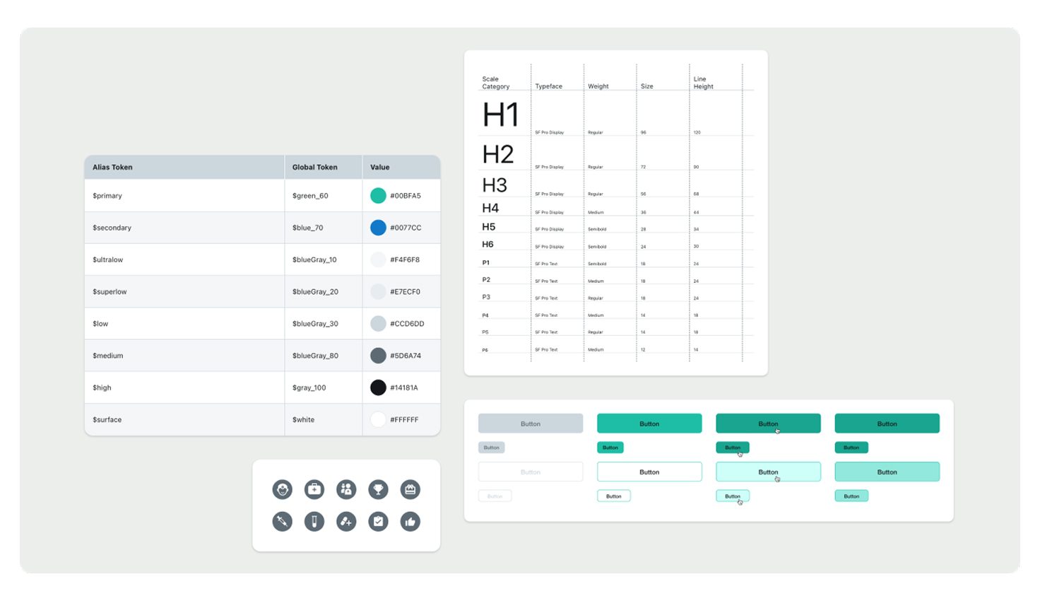
Some of the UI components, color, and typography tokens.
My first step was to establish design‑ops foundations. I cleaned and reorganized the master Sketch files and set up a pattern library of reusable components, giving the team a single source of truth and making collaboration far more efficient.
Next, I tackled the information architecture. Using card‑sorting sessions and whiteboard workshops with stakeholders, we defined logical “buckets” such as Fitness, Mental Health, and Nutrition. These buckets formed the backbone of a new navigation structure that let users find the content they needed without digging through endless screens.
Quick video of the design system's documentation on Zeroheight.
To keep the growing product consistent, I led the creation of Sharecare’s design system. We audited every existing UI element, aligned them under a customized Material Design foundation (its documentation and availability was key to meet the tight deadline we faced), and documented everything in Zeroheight. Tokens were introduced for colors, spacing, and typography, with a three‑tier hierarchy (global → alias → component) that made scaling effortless.
Accessibility was baked in from day one. Contrast ratios meeting AA/AAA standards were encoded directly into the token set, and dark‑mode parity was ensured across all components.
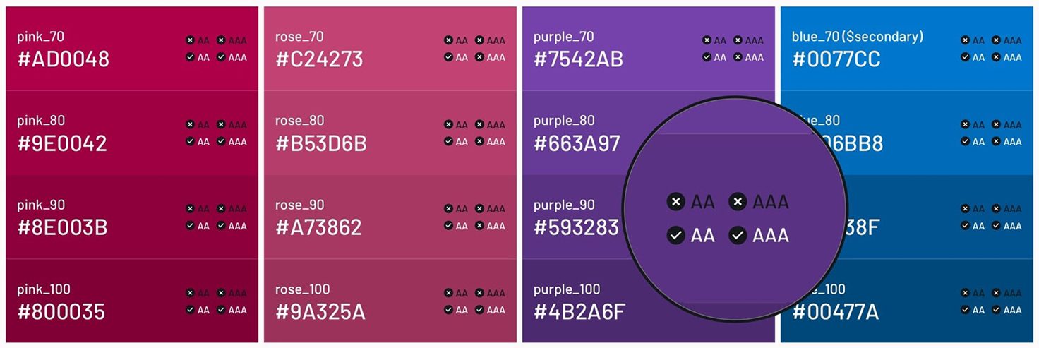
Some of the color documentation with accessibility rating.
Throughout the effort, I introduced collaboration tools such as Abstract for version control and cross‑team visibility, which allowed remote designers to contribute without stepping on each other’s work. Regular design reviews and stakeholder demos kept everyone aligned and highlighted the value of a unified system.
©2025 Daniel Carrasco Lara. Some rights reserved.